You can create custom analytics dashboards from the Analytics View using Distribution and Correlation charts.Documentation Index
Fetch the complete documentation index at: https://docs.encord.com/llms.txt
Use this file to discover all available pages before exploring further.
Distribution charts
Distribution charts display distributions and summaries of the selected metrics and custom metadata. Here are some examples:- Data unit: Height, Width, Frame number
- Label: Label duplicates, Broken track, Inconsistent track, Inconsistent class
- Categorical: Workflow stages, Custom Metadata (enum with their enum options, numeric, date time, and boolean), Classes, Annotator, Attribute
varchar (previously string), text (previously long_string), and uuid are NOT SUPPORTED for use in Distribution charts.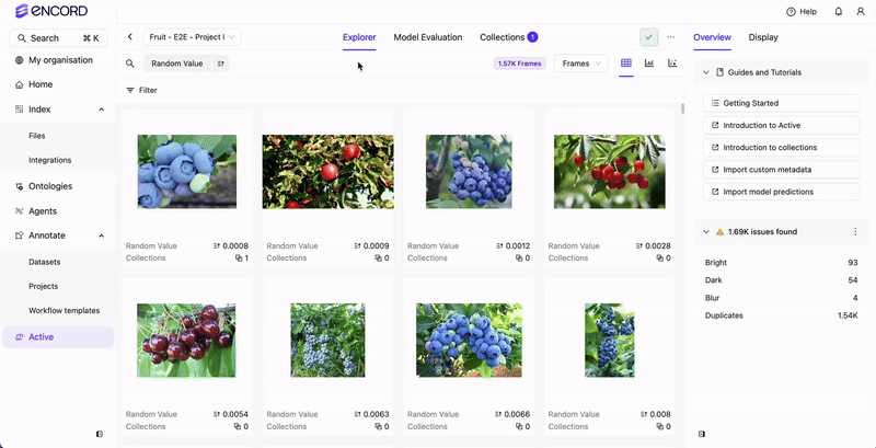
Correlation charts
Correlation charts display a scatter plot of two attributes to show correlation within your current filtered view. Correlation charts require numeric data.While Distribution charts support a number of custom metadata types, Correlation charts ONLY SUPPORT
numeric custom metadata.
Create Custom Analytics Dashboard for Active
- Go to Active.
- Click into a Project. The Active Explorer appears.
- Click Videos, Frames, Labels, or Predictions.
The criteria available for the charts changes with each tab.
- Click Analytics view.
- Specify the display criteria for the Distribution and Correlation cards that display by default.
- Click Add chart to add additional Distribution and Correlation cards.
- Specify the display criteria for the added Distribution and Correlation.