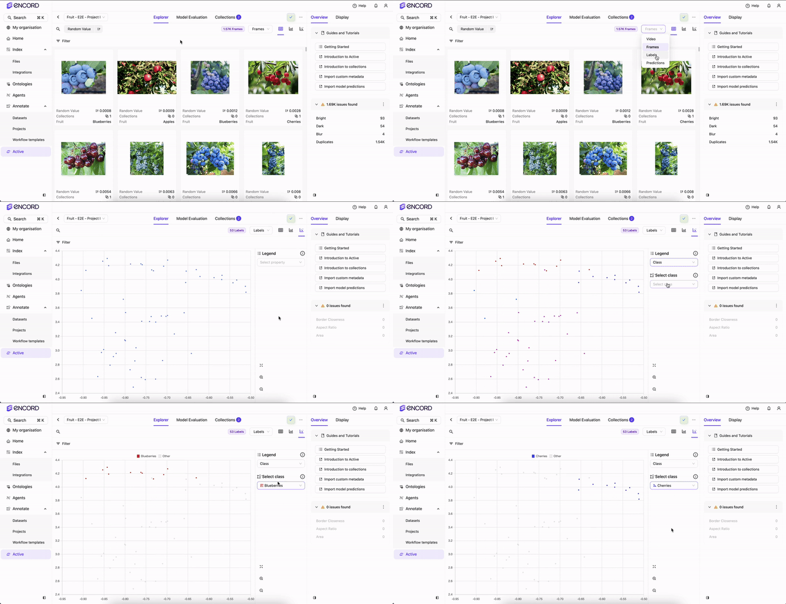
Encord Active incorporates embedding plots — a two-dimensional visualization technique employed to represent intricate, high-dimensional data in a more comprehensible and visually coherent manner. This technique reduces data dimensionality while preserving the inherent structure and patterns within the original data.
The embedding plot aids in identifying interesting/noteworthy clusters, inspecting outliers, and excluding unwanted samples. Accessible on the Project > Explorer page, the embedding plot is adaptable to data, labels, and predictions.
 Notice how images are clustered around certain regions. By defining a rectangular area on the plot, users can quickly isolate and analyze data points within that defined region. This approach facilitates the exploration of commonalities among these samples.
Hover over clusters or individual data points on the plot to visually check frames.
Upon selecting a region, the content within the Explorer page adjusts accordingly. Various actions can be executed with the chosen group:
- Use Collections to tag and group images.
- Investigate the performance of the selected samples within the Predictions page.
- Establish subsets similar to these and then conduct comparisons.
The embedding plot is adaptable to data, labels, and predictions. In addition to selecting points within a rectangular area, the label embedding plot offers the functionality to filter data points based on the label classes.
- Identify classes that are often confused with each other.
- Detect samples with incorrect labeling, such as instances of a different class embedded within a larger cluster of another class.
- Spot outliers and subsequently eliminate them from the dataset.
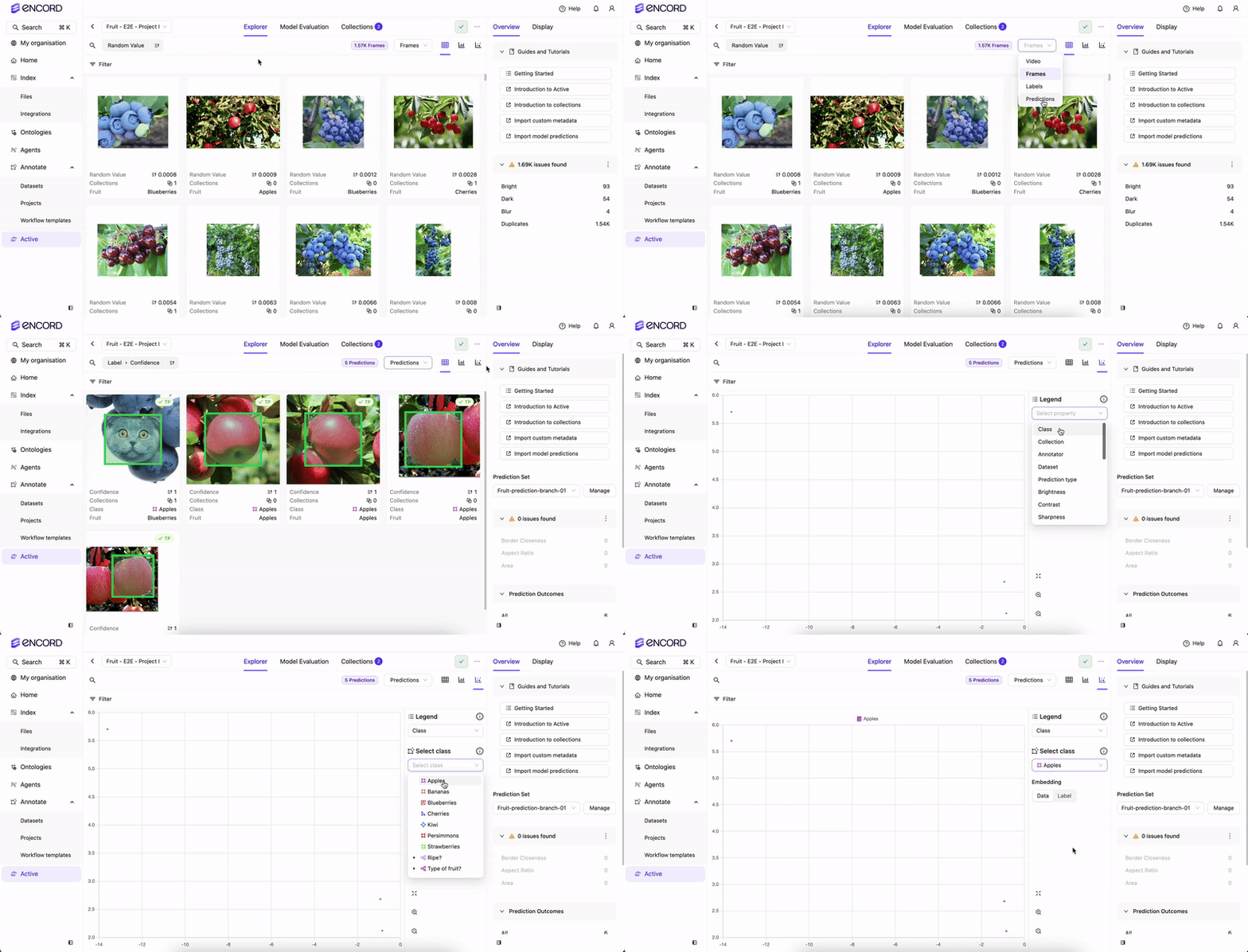
 With the predictions embedding plot, users can:
- Identify predictions and ground truth labels
- Identify false positive and true positives in model predictions

 Notice how images are clustered around certain regions. By defining a rectangular area on the plot, users can quickly isolate and analyze data points within that defined region. This approach facilitates the exploration of commonalities among these samples.
Hover over clusters or individual data points on the plot to visually check frames.
Upon selecting a region, the content within the Explorer page adjusts accordingly. Various actions can be executed with the chosen group:
 With the predictions embedding plot, users can:


