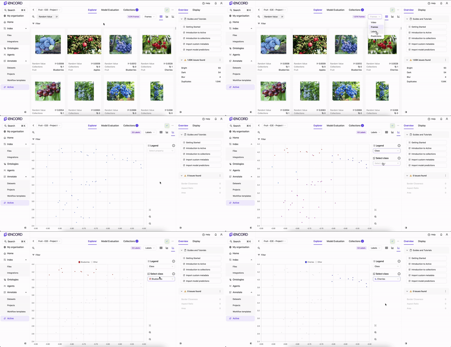
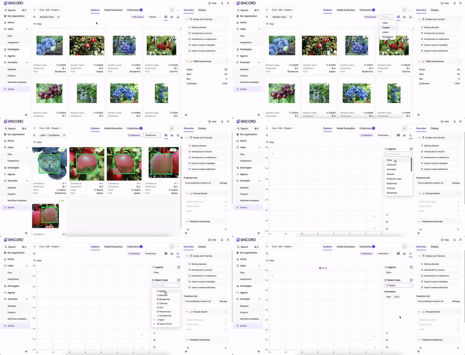
The embedding plot is a two-dimensional visualization technique used to represent high-dimensional data in a more interpretable and visually accessible form. By reducing the dimensionality of the data, the embedding plot helps preserve the underlying structure and patterns of the original data. In the plot, each data point is represented as a single point in the two-dimensional space, with proximity indicating similarity and shared characteristics among corresponding high-dimensional data points. This allows selecting points within a specific rectangular area, enabling a focused analysis of a particular subset of data points. By defining a rectangular area on the plot, users can quickly isolate and examine the data points that fall within that region. The selection can be based on specific criteria or visual observations, allowing further exploration of attributes or additional analysis on the chosen subset. This interactive functionality enhances the ability to gain deeper insights into underlying patterns and relationships within the selected area, providing a flexible and intuitive way to analyze and understand the data points within the dataset. Based on the selected option in the Order by drop-down, users can choose to visualize either the embedding plot for the data or the labels.Documentation Index
Fetch the complete documentation index at: https://docs.encord.com/llms.txt
Use this file to discover all available pages before exploring further.
Active
 After using the embedding plot and filtering, create a Collection.
Data Embedding Plot
 Label Embedding Plot
 Predictions Embedding Plot

Annotate
Prerequisites
Before you can use embedding plots in Annotate, calculations must be performed using Encord default embeddings or using your own custom embeddings.- Log in to the Encord platform. The Encord home page appears.
- Click Projects. The Projects page appears displaying all Projects you have access to.
- Click a Project.
- Click Explore.
- Click Metrics & Embeddings.
- Click Compute for either option.
-
Specify the following:
- Similarity & Natural language search and quality metrics: Enable to compute embeddings and quality metrics. Access quality metrics for filtering and sorting.
- Select embeddings: Default embeddings are computed by Encord. Alternatively, import and select your own custom embeddings.
- Embeddings plot, Diversity and Uniqueness metrics: Enable to compute UMAP reduction to generate 2D embeddings plots to visualize your data. Also access diversity and uniqueness metrics for curation.
- Click Start computation.
Using Embedding Plots
- Log in to the Encord platform. The Encord home page appears.
- Click Projects. The Projects page appears displaying all Projects you have access to.
- Click a Project.
- Click Explore.
- Click Frames or Labels.
- Click the Embeddings View icon. The Embeddings View page appears.
Label Embedding Plot

