You can use Data Groups in non-Consensus Projects and Consensus Projects with Review & Refine nodes. Determine Consensus nodes are not yet supported.
Create Data Groups
Each of the code examples does the following:- Specifies the data units to add to a Data Group.
- Creates the Data Groups and specifies the layout in the Label Editor.
- Adds the Data Groups to a Dataset.
- Adds the Dataset to a Project.
Data Group - Grid (Default)
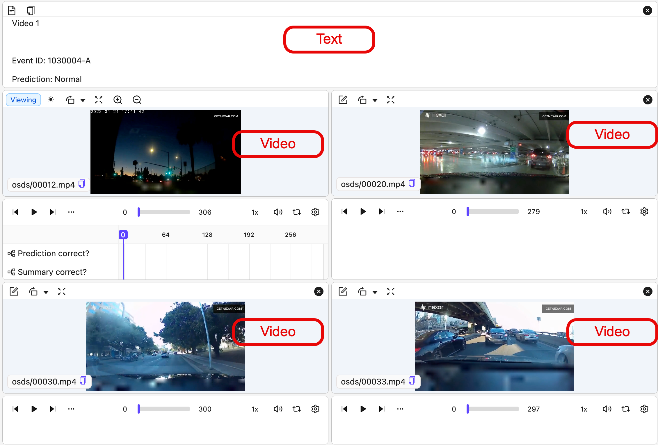
Grid Data Groups allow you to arrange multiple data units in a fixed, ordered grid within the Label Editor. The order of the data units in the group determines their visual arrangement in the grid.All layouts (grid, carousel, custom) are limited to 50 data units. Attempting to create a data group with more than 50 data units results in an error.
 12 data unit Data Group Grid
 Requirements
To display data units in a grid layout, you need:
Requirements
To display data units in a grid layout, you need:
- A list of data unit UUIDs in the exact order they should appear in the grid.
- A call to DataGroupGrid(…) when creating the Data Group:
Data Group - Grid
Data Group - Carousel/List
The order of data units in a Data Group determines how they are arranged in the Label Editor. In the carousel/list layout, a scrollable panel on the left shows all data units in the Data Group, while the currently selected data unit appears in the main editor view. Requirements
To display data units in a grid layout, you need:
Requirements
To display data units in a grid layout, you need:
- A list of data unit UUIDs in the exact order they should appear in the grid.
-
A call to
DataGroupCarousel(...)when creating the data group:
Data Group - Carousel
Data Group - Custom
Custom Data Groups give you full control over how multiple data units are arranged in the Label Editor. Unlike grid or carousel layouts (which use ordered lists of UUIDs), custom layouts use keys:- Map keys to data unit UUIDs.
-
Build a layout tree that references those keys and defines:
- Split direction (“row” or “column”)
- Space split (“splitPercentage”)
- Where each tile (data unit) appears in the Label Editor
Custom Data Groups can be configured using plain Python dictionaries or ORMs.
- Using Python dictionaries — a lightweight, flexible approach
- Using ORMs — a more structured approach with stronger typing and validation
Custom Data Groups Details
Custom Data Groups Details
To create a custom data group, you must define a layout, layout contents, and (optionally) settings. These components work together to control how data units are displayed and behave.1. Define the layout structureThe layout defines how the Label Editor is split and which data units appear in each section.
Layouts are expressed as a tree of containers and data unit tiles.2. Provide layout contents3. (Optional) Configure tile settingsTile settings let you control behavior such as making a tile read-only.
Settings reference the same keys used in the layout.4. Create the Data GroupFinally, create the Data Group by passing the layout, layout contents, and settings.
layout_contents maps each layout key to a data unit UUID.
Every key referenced in the layout must be defined here.Custom Data Group Examples
Custom Data Group Examples
- Example: 2-panel split
- Example: Instructions + 2×2 grid layout
- Example Carousel-style in a Grid-style
A simple layout: left panel (instructions) and right panel (image).
Get Data Group Data Units
Use the following to get the data units that comprise a Data Group.Get Data Group Information
Use the following script to view:- Group layout contents
- Group layout
- Group layout settings
Data Group Summary
Multi-Layer Data Groups
Multi-Layer Data Groups allow you to apply labels across all data units in a group simultaneously. Any label added or edited in the Label Editor is automatically applied to every data unit in the group. These shared labels are exported under theroot key, which contains all label information that applies to the Data Group as a whole.
To create a Multi-Layer Data Group, set has_multilayer_labels=True in the group settings when creating a custom Data Group:
Read-Only Tiles
You can mark individual tiles in a Data Group as read-only. Annotators can view a read-only tile in the Label Editor but cannot add labels to it. This is useful for tiles that provide reference context — such as an instructions document or a reference camera feed — that annotators should see but not annotate. Theis_read_only flag lives in settings.tile_settings in the manifest JSON, keyed by tile name. When you serialize a Data Group, Encord projects the per-tile read-only flag into settings.tile_settings automatically.
Manifest JSON example
The read-only flag round-trips correctly through manifest import and export. Renaming a tile preserves its read-only flag. Deleting a read-only tile removes the flag cleanly from the manifest.