


Cohort Comparison via Slices
Encord lets you define named filter sets called slices and compare data distributions across multiple cohorts simultaneously on the same chart. Each slice appears as its own series, enabling side-by-side comparison without manually switching filters.The Slice Strip
A Slice strip appears at the top of the Analytics canvas and is the primary control for creating and managing slices. It contains:- All data — an unfiltered baseline chip that is always present. You cannot remove or rename it.
- Current filters — a transient chip that appears automatically whenever you have active toolbar filters. It shares the same filter set as the grid view, and has a dashed border to distinguish it from saved slices. Clicking it opens the Current filters editor.
- User-defined slices — named slices you create by clicking + Add slice.
- Add new chart — opens a menu to add a Distribution or Correlation chart to the canvas. This button replaces the former floating bottom-right button.
- How it works? — opens an illustrated modal explaining bucket-width snapping, shared-grid rebinning, and how hiding slices affects charts.
Slices are saved to your browser’s local storage, keyed by project. They persist across page reloads but are specific to your browser and are not shared with other collaborators.
Adding and Managing Slices
1
Add a slice
Click + Add slice in the Slice strip. Encord creates a new empty slice and immediately opens the slice editor popover.
2
Configure the slice
In the slice editor, you can:
- Rename the slice.
- Choose a color for the slice’s series on charts.
- Set filters using the filter controls and any saved presets to define the cohort.
- Click View in Explorer to apply the slice’s filters as the active filter set and navigate to the grid view.
3
Save the slice
Close the slice editor popover. The slice chip appears in the Slice strip and Encord immediately adds it as a series on all distribution charts.
4
Edit a slice
Click the pencil icon on a slice chip to reopen its editor and change its name, color, or filters.
5
Hide a slice from charts
Click the eye icon on a slice chip to hide that slice. Encord excludes it from chart queries and the comparison footer entirely, not just from the visual display. Click the icon again to restore it.
6
Remove a slice
Click the remove icon on a slice chip to delete it permanently.
Multi-Series Distribution Charts
When you have saved slices or an active Current filters set, distribution charts render as multi-series grouped bar charts — one bar series per visible slice. The All data baseline always appears as a series unless you hide it. A comparison footer below each chart mirrors the visible series from the Slice strip with a per-cohort count summary. Each distribution chart also offers two bucket alignment modes, which you can toggle directly on the chart:Empty Analytics Dashboard
When the Analytics canvas has no charts, Encord displays a headline and quick-start cards. Click a card to add a Distribution or Correlation chart directly to the canvas.Distribution charts
Distribution charts display distributions and summaries of the selected metrics and custom metadata. Here are some examples:- Data unit: Frame number, random value, area
- Metadata: Enum with their enum options, numeric, date time, and boolean
varchar (previously string), text (previously long_string), and uuid are NOT SUPPORTED for use in Distribution charts.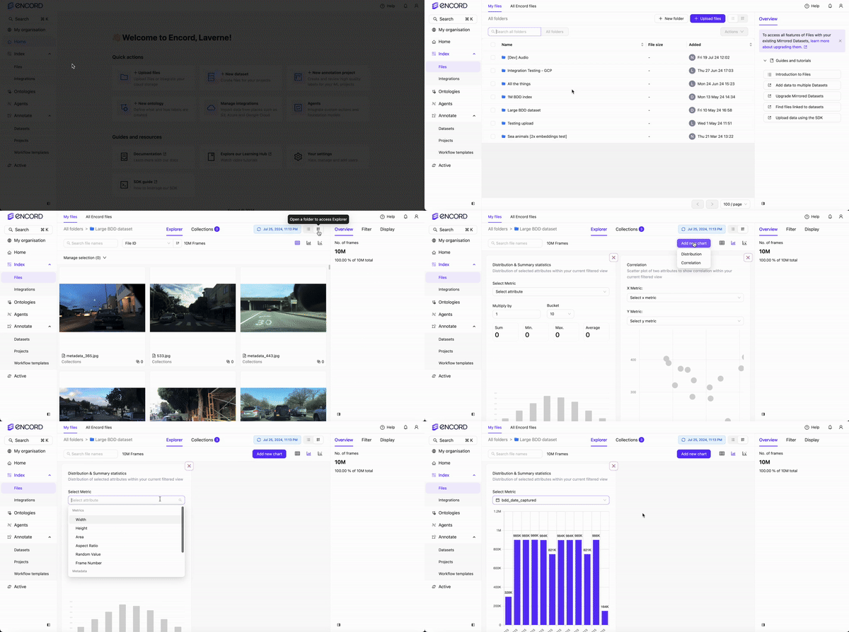
Correlation charts
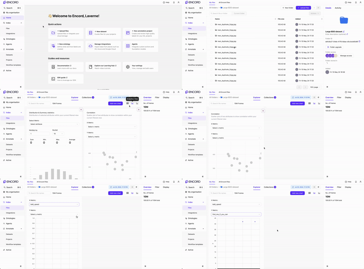
Correlation charts display a scatter plot of two attributes to show correlation within your current filtered view. Correlation charts require numeric data.Distribution charts support a number of custom metadata types, however Correlation charts ONLY SUPPORT
numeric custom metadata.Correlation charts always display data for the current unfiltered view and do not support multi-series slice comparison.
Stat tiles
Stat tiles display a horizontal bar chart with one bar per slice. Each bar’s length is proportional to the item count of the largest slice currently in view, so you can compare slice sizes at a glance even when a small slice sits alongside a much larger baseline. The right-hand label shows the item count and the percentage of the baseline count. Bar order runs from top to bottom: the unfiltered All data baseline appears first, followed by any active toolbar filter slice, then your user-defined slices.When an embedding-distance filter is active, Stat tiles cannot retrieve a count for the affected slice and displays a dash (
-) in place of the count.Metadata coverage
Metadata coverage displays one row per metadata key. Each row contains one horizontal bar per slice, showing how many items in that slice have that key populated. All bars share a common scale — the highest single-slice count across all displayed rows — so you can compare coverage both across slices within a row and across rows for the same slice. Use this chart to identify which metadata fields carry signal (high coverage) and which are sparsely filled across your dataset slices. Selection modes Metadata coverage offers two ways to choose which keys to display:- Auto mode (default) — Encord automatically shows the top 20 keys by total coverage across all slices.
- Explicit mode — You select specific keys using the Keys multi-select dropdown. Selecting or removing any key switches the chart into explicit mode.
If your project has no client metadata schema, or if the data query fails, Metadata coverage displays clearly labeled example data so the chart remains usable. The chart caption indicates when example data is showing.
Project Overview summary cards
The Overview tab of a workflow Project displays a set of summary cards that give you an at-a-glance view of Project health and progress.All summary cards described below are hidden for labeling-services-only Projects.
Stat cards
A row of three compact stat cards appears at the top of the overview:- Tasks completed — shows completed tasks out of the total task count, with a Project status selector in the footer.
- Time spent — shows the total time annotators have spent on the Project. When time data is available, a Show breakdown link navigates to the Collaborators tab in Analytics.
- Opened issues — shows the number of currently open (unresolved) issues. When open issues exist, a Show tasks link navigates to the Project queue filtered to tasks with unresolved issues.
Class distribution card
The Class distribution card shows a horizontal bar chart of label instances by class. It displays the top 5 and bottom 5 classes by instance count. When more classes exist between those two groups, the card shows a truncation indicator for the hidden middle classes.- The card subtitle shows the total number of label instances (for example, “1,234 label instances”).
- When no label instances exist yet, the card displays “Instance labels by class will appear here.”
- When data is available, a Show analytics link navigates to the Labels tab in Analytics. This link is hidden when the card is empty.
Top issue tags card
The Top issue tags card replaces the previous Issues overview card. It shows up to 10 issue tags ranked by frequency, displayed as amber-colored horizontal bars. The card subtitle shows the total number of issue tags created for the Project.- An info popover on the card explains what issue tags are and links to documentation.
- A Show analytics link navigates to the Issues tab in Analytics. This link is hidden when the card is empty.
- When no issue tags have been used yet, the card displays “Most common issue tags will appear here” and a Setup issue tags link to issue-tag settings.
Tag bar counts reflect tag-action totals rather than unique issue counts. The count for untagged issues is a frontend approximation and may under-report — it can show 0 even when untagged issues exist.
Custom Analytics Dashboard
- Navigate to Data > Explore and select a folder.
- Click Analytics view.
- Specify the display criteria for the Distribution and Correlation cards that display by default.
-
Click Add chart to add additional charts. The menu offers four chart types:
- Distribution — shows distributions and summaries of selected metrics and custom metadata.
- Correlation — shows a scatter plot of two attributes to reveal correlation within your current filtered view.
- Stat tiles — shows a horizontal bar chart with one bar per slice, displaying item counts relative to the largest slice and as a percentage of the baseline.
- Metadata coverage — shows, for each metadata key, how many items in each active slice have that key populated.
- Specify the display criteria for the added chart.